
Styles and design tokens
Adjust the selected element and reuse design decisions across your project.
On this page
Style the current selection
The Style panel follows the selected element. Layout, spacing, typography, background and effects controls expose the supported properties. Use the unit menu for values such as px, %, rem and em where the property supports them.
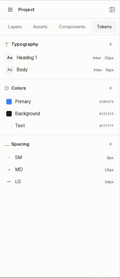
Connect a color or typography token
Choose a token from the picker’s Tokens tab. A connected field displays the token name rather than only its raw value. Opening an already connected color field starts on Tokens. A typography token controls the related font properties together.
Use an image background
Choose an image from the Background control, then adjust its size, position and repeat behavior. Removing the image does not need to remove the background color.